Location Two
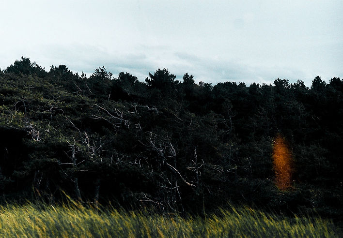
Burbage Common
In the mise-en-scene of our second setting we wanted to establish the feeling of ennui that we had made our main aim in presenting through the narrative of our story. To do this we graded the footage of our video to give it a soft and warm look reminiscence of the soft expired film used to shoot many of our childhood memories on. Another choice of using the woods allowed us to use locations that were familiar to us as children and that we used to play in as young kids, again adding to the factor of ennui.


The use of soft focus throughout our music video also adds to the mise-en-scene as it establishes the rose-tinted view of childhood given through adulthood and how only the positives remain in hindsight as respite from day to day life. Our filming is very conventional, following our inspiration from Wes Anderson as a director it meant we tried to incorporate lots of use of tripods throughout the opening minute of our video, from 00:05 follow this technique following our subject as he walks through centre frame. This draws the viewer’s eyes along the frame of our video complimenting the symmetrical framing following conventions established throughout Wes Anderson’s work. This stability, however, we wanted to disregard as the music became more hectic and became a fuller sound 03:34, this meant we transitioned to handheld filming for a lot of the music video, a common convention in alternative emo music, this also allowed us to show the mental instability of the main character through the use of camera shake, symbolising the tone of the song. These uses of the camera are unconventional in traditional music videos, therefore making our music video stand out in comparison to conventional music videos. The woods set we used is quite a familiar convention in alternative music videos as it is a fairly common and cheap location to shoot at, this allowed us to shoot consistently without the risk of paying for re-shoots each time we need to correct an error.

Evaluation
After a wide array of research and evaluation as a group into the mise-en-scene of conventional music videos, camera angles, locations and editing. We eventually decided on a schematic theme of which wanted to follow throughout our media products. We took inspiration from multiple sources and chose to adapt our product through the lens of videos and directors we loved.
Digi-pack
My Digi-Pack juxtaposes the common conventions for the product. Throughout my research, I looked at albums mainly created during the 1960’s. This was where I was first inspired to capture the nostalgic, vintage and simplistic aesthetic established through the use of 35mm film. However, I still wanted to subvert the common creative elements of Digi-pack establishment to do this, instead of creating a traditional CD cover and format I instead chose to emulate the format and packaging of a cassette on my Digi-Pack. This is a diversion from the conventions that I had not seen before and that I felt helped symbolise the motif’s established in our music video. The use of a cassette formatting was to capture the same sense of nostalgia that we had played off in our music video, it relates back to the feelings of youthful nostalgia listening to new demo tapes by your favourite bands. I used the imagery of my Digi-pack keeping with the common conventions of alternative music and kept it simplistic. I only used two different photographs throughout my whole Digi-pack. I wanted nostalgia to be throughout every piece I made for this coursework, and I have laden my Digi-pack with nostalgic imagery.

Another form I decided to follow was the legal print and record label, this is one of the most obvious conventions of Digi-packs. This is why I did not want to edit these boundaries otherwise my product would be separated from my source material. I did, however, decide not to include a bar-code on my Digi-pack, I felt it created a disconnect from the album artwork and had no place that would fit in with my Digi-pack’s aesthetic. Instead, I decided that the bar-code would be included on the cellophane wrapper surrounding the album.


My front cover has been taken using my film camera, I noticed front covers taken with a film camera were a common convention used in most of the Digi-Packs that I looked at, this allowed me to both emulate and follow conventions of conventional CD Digi-packs and yet also follow the continued theme of enuui that I put forefront of my mind when creating my product. The nostalgia regarding the use of film, with its imperfect finishes and blemishes made it perfect for my front cover, showing the imperfections of life yet also with the warm and comforting tones that come about through the use of a warm 200-speed film showing the comforting and rose-tinted outlook on childhood everyone has.


On the front cover, I challenged the convention of having mid/close up shots of my artist as the front cover and instead disregarded this all to have a long shot of a child as my front cover image. This allowed me to establish the symbolic themes of my ancillary texts and keep a consistent aesthetic format throughout all of my products. The use of this image makes my Digi-pack more unique and stand out when compared to other conventional Digi-packs created by different artists. Inspired by the Ty Segall album ‘Reverse Shark Attack’ my front cover has abstract imagery unrelated to my music video at first and also the common beach life element.

Office Scene
Location One
Our music video had two refined and separate established environments, each set followed its own mise-en-scene. Our first set was an office environment, we wanted to establish the mundane nature of office life. In an attempt to do this we kept the setting plain, pale and uninteresting, we wanted it to immediately show from the first frame the tired, morose and monotonous lifestyle that is established through the bright clinical lighting, desaturated picture format and a look of sorrow on the main characters face. This creative decision was influenced heavily by David Fincher’s 1999 film ‘Fight Club’. We wanted to capture the same sense of rising stress and tension that was used throughout the office scene in Fight Club and incorporate it into our own product. Establishing the atmosphere of our product initially through twenty seconds of homage.

Magazine Advert
Through my analysis of different magazine adverts I found and analysed multiple different products and genre’s all with a plethora of generic conventions allowing my to discover elements I wished to implement and promote in my advert. I also found coinciding information throughout my Digi-pack, music video and magazine advert. Inspired by Joyce Manor album release tour posters I was inspired by the simplistic and raw format projected throughout the posters and merchandise. I liked the conventional formatting of the artist name, album name and record label and kept those consistent to conventional media products. I added all of these features enabling my media products to successfully advertise my Digi-pack and music video.


I wanted to place my artist’s record label into my magazine advert in an attempt to promote the record label throughout the media. I found this a convention of smaller record labels throughout my research. It clearly presents the distributing label and is an easy addition to my work giving it a more professional aesthetic.

There is a common theme of photographic similarities throughout adverts and album art that I felt needed to be utilised throughout my work. This gives a sense of conformity and sensibility that makes my work look professional, unlike some other works. This was inspired by the Death Grips tour poster clearly advertising their recent advert through symbolic references to the original art of their album ‘The Money Store’


